Upload date
All time
Last hour
Today
This week
This month
This year
Type
All
Video
Channel
Playlist
Movie
Duration
Short (< 4 minutes)
Medium (4-20 minutes)
Long (> 20 minutes)
Sort by
Relevance
Rating
View count
Features
HD
Subtitles/CC
Creative Commons
3D
Live
4K
360°
VR180
HDR
1,873 results
This amazing Excel trick will transform how you analyze your data! In this video, I'll show you how to create interactive Excel ...
275 views
11 hours ago
Do you have a stack of grease-covered index cards or scattered bookmarks for your favorite meals? NotebookLM isn't just a ...
197 views
6 days ago
Introduction to Visual Analytics: Understanding Data Types and Structures In this video, we dive into the essential aspects of ...
0 views
2 hours ago
In this video, I map out the titles of the top 1200 videos on AI using https://infranodus.com and use the data visualization to reveal ...
908 views
1 day ago
Try V-Ray (Trial) → https://bit.ly/vray-trial-aga 3ds Max & V-Ray / Corona Visualization Course ...
3,114 views
2 days ago
The warning “Driving visualization temporarily degraded” in your Tesla may mean just a temporary problem with camera view.
Can you solve this geometry challenge in just 30 seconds? ⏱️ In this viral math problem, you are given a beautiful triangle with ...
4,234 views
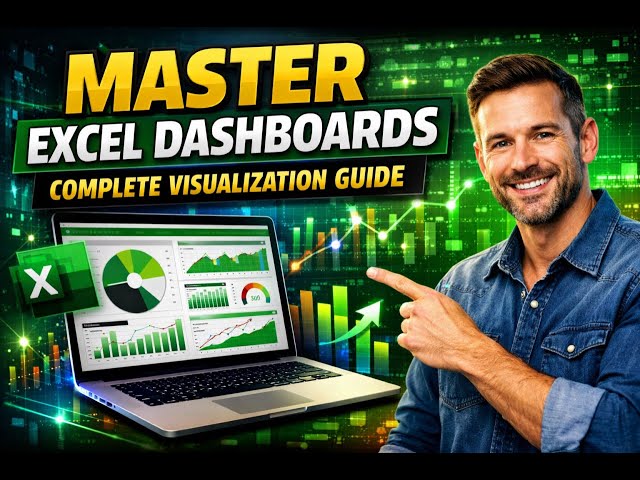
The Ultimate Excel Dashboard 2026: 12 Data Science Hacks to Visualize Data Like a Pro Take your Excel dashboards to the next ...
353 views
5 days ago
Ritual Magic, Pathworkings are Qabalistic Tree of Life Explorations that guide the Journeyer through a series of Spiritual ...
35 views
3 days ago
Join Patrick LeBlanc and Phil Seamark on this episode of Fabric Tech Talk Fridays as they explore how AI and language models ...
1,671 views
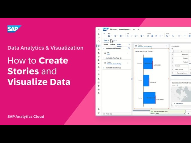
In this video, you will create a story and explore the data visualization options available in SAP Analytics Cloud. Chapters: 0:00 ...
60 views
Your sophisticated model is worthless if the results look like a mess on a slide. But here is the biggest mistake analysts make: Do ...
28 views
Learn how to design a professional Excel dashboard that transforms raw data into clear, insightful, and visually stunning data ...
24 views
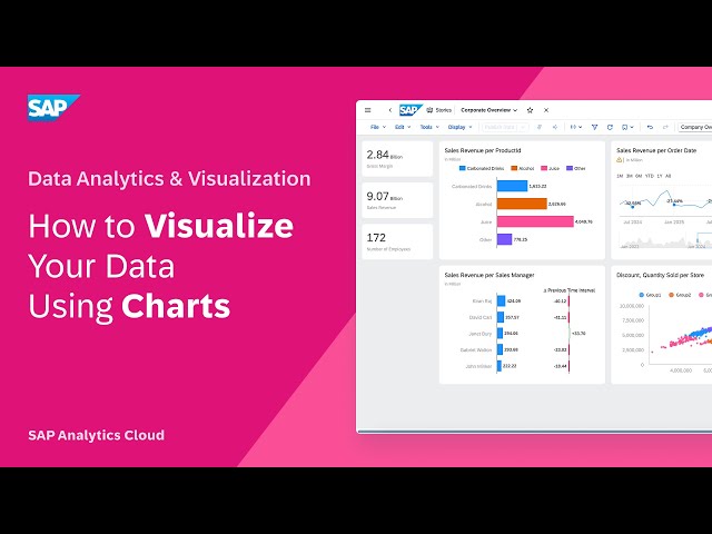
In this video, you will explore the options available to visualize your data using different types of charts and to refine those ...
69 views
Step inside this beautifully designed five-bedroom maisonette, offering a perfect blend of comfort, style, and modern living.
147 views
The Creation of the World | Genesis 1 | Cinematic Visualization of the Bible In the beginning, God created the heaven and the ...
29 views
Artist: Grapes2You Album: Thirdborn Released: 2026 Genre: Ethno folk, Ukrainian Music.
57 views
January 2026 Blog: aka.ms/powerbijan2026update We hope you'll join us at FabCon Atlanta, March 16-20. Register now using ...
9,821 views
AI decisions are rarely black and white, and asking for a simple "yes" or "no" throws away valuable information. In this video, we ...
14 views
See your data on Google Earth's real-world canvas. You can now import large-scale KML and GeoJSON datasets—up to billions ...
920 views